Best Paint Colors to Sell a House Fast: Neutral Hues That Make a Lasting Impression
- Yulonda Buster

- Apr 28, 2025
- 12 min read
Ever noticed how the best paint colors to sell a house fast often feature neutral hues? There’s a pretty good reason for that—these shades are more than just a trend; they're a strategic tool in making a lasting impression.
Now, I’m not talkin’ about boring beige and flat white—far from it. The right shade can wrap a buyer in that “this feels like home” warmth before they even take off their shoes. It’s not just paint; it’s mood, it’s energy, ultimately, it’s money in your pocket.
But which shades truly make your home stand out? Stick with me, and I’ll walk you through how to work a paintbrush like a magic wand.
Ready to paint your way to a quick sale? Let's find the perfect shade.
Why Neutral Paint Colors Work Wonders on Buyers

Alright, sugar, let me tell you—neutral colors might look quiet, but they sure know how to speak to buyers.
And when it comes to selling your home, understanding the psychology behind neutral colors can be your secret weapon.
When someone walks into your home, those soft, easy-on-the-eyes shades create an instant sense of calm and comfort. They help folks feel like they can just breathe—like they’re already home.
And the best part? Neutrals give buyers the freedom to imagine their own life in your space.
Suddenly, they’re placing their favorite knick-knacks and family photos in the space and picturing Sunday brunch by the window.
Of course, cultural influences tend to shape how different neutral colors are perceived—so it’s important to consider your potential buyers’ background and culture here. However, most folks these days are drawn to that clean and modern look that neutral tones deliver so well.
Just don’t go overboard. Too many neutrals can feel a bit lifeless, like a party with no music. So mix it up a little:
Charcoal grays bring in a strong, grounded energy—while creamy whites and soft taupes keep everything fresh and bright.
It’s all about balance, baby. A little warm, a little cool—and you’ve got yourself a space that feels just right.
Selling a house fast takes more than good paint; it takes vision. Let Designs by Duchess stage your home with soul and Southern charm.
The Power of Warm vs. Cool Neutral
In terms of picking paint colors, the battle between warm and cool neutrals is real—and you gotta know which side you wanna be on! By choosing colors that evoke positive emotions, you’ll create a welcoming atmosphere that resonates with potential buyers.
Warm neutrals wrap you in a cozy hug, making your living spaces feel inviting, while cool neutrals strut their modern stuff, giving your home a sleek vibe. Finding the right balance between these two can be the secret sauce to attracting buyers faster than you can say “open house.”
Warm Neutrals' Inviting Nature

Warm neutrals are perfect for creating a space that feels inviting and relaxed. Shades like taupe and beige give off a peaceful, homey vibe, helping buyers feel like they’re stepping into a place they can settle into right away.
These colors also play wonderfully with natural materials, like wood and stone, bringing in a bit of texture that really makes a space shine.
Did you know that a whopping 81% of experts recommend warm neutrals to boost your home’s value? Now that’s a number you can’t ignore!
Homes that feature these warm shades tend to sell faster and for higher offers—especially when they are paired with strategic staging techniques. When the space feels warm and welcoming, buyers can imagine it as their own, making your home a canvas for their dreams.
Cool Neutrals' Modern Appeal

Cool neutrals are your ticket to a fresh and modern look. Think soft grays and muted taupes that work with sleek, contemporary lines. These colors give off a clean and stylish vibe, like a favorite pair of jeans that never go out of style.
In spaces with lots of natural light, light grays tend to brighten things up and make the room feel airy and spacious. They also pair beautifully with natural materials, like marble and steel, creating a chic, cohesive look.
When it comes to bathrooms and kitchens, cool neutrals keep things looking sharp and functional.
Just a heads-up—too much coolness in dimly lit spaces can make them feel a bit chilly. So, use cool tones where the sunlight shines through!
Balancing Warm and Cool Neutrals

Finding the right balance between warm and cool neutrals is simpler than you think.
Start with warm shades like beige and taupe for that cozy, welcoming feel—especially if you’ve got brown floors. These colors reflect natural light, making rooms feel spacious and inviting.
Then, add in some cool neutrals, like light gray, to keep the vibe fresh and modern without overwhelming the space. You can even sprinkle in earthy tones like muted greens or terracotta to bring a little character, all while keeping it subtle.
Neutral tones are key because they make buyers feel like they can move right in and start living, with little to no updates to the space.
And don’t forget, it's all about contrast! Mix warm and cool for accent walls or trims to keep things exciting without feeling cluttered. Soon enough, you’ll have buyers saying, “I can picture my life here!”
How Lighting Can Change the Look of Neutral Paint

If you’ve ever painted a wall and thought, “Why does this look different than it did in the store?” you’re not alone. Light can work a little magic—or mischief!—on those neutral tones, totally transforming how those colors look and feel from room to room, and even from hour to hour.
Here’s what you need to keep in mind:
Warm lighting (think soft yellow bulbs) wraps your space in a cozy hug, making creamy whites and gentle beiges feel soft, relaxing, and oh-so-inviting.
Cool lighting (think bright white LEDs) brings out cooler tones in your neutrals. It’s perfect for sleek, modern vibes, but it can also make neutrals feel a little chilly and stark if overdone.
In short, different light types have varying color temperatures and intensities, contributing to how neutrals are perceived in various lighting conditions.
And let’s not forget about the sun! It changes throughout the day, with morning light bringing a greenish tint that makes cool tones feel crisp, while evening light adds a golden glow, warming up any space with comfort and charm.
So, if you're picking a paint color, be sure to check it at different times of day, sugar. What looks creamy in the morning may lean gray by sundown. If you want to see colors in their truest form, observe them under the midday sun.
Best Neutral Paint Colors for Selling Your Home

Alright now, let’s talk paint—because the right neutral color on your walls can turn a “maybe” into a “Where do I sign?”
When you’re getting a house ready for the market, you want every room to feel like a warm hug. The goal is simple—make buyers feel at home the second they walk in. And honey, these tried-and-true shades do just that!
Here are a few of my go-to favorites that always work their magic:
Color | Brand | Vibe |
Swiss Coffee | Benjamin Moore | Bright, versatile warmth |
Accessible Beige | Sherwin-Williams | Earthy elegance |
Agreeable Gray | Sherwin-Williams | Balanced gray-beige |
October Mist | Benjamin Moore | Serene sage green |
These shades don’t just freshen up a space; they let buyers imagine their future in your home. And those warm-tinted neutrals, in particular, bring that extra cozy factor buyers just can’t resist.
Want to go the extra mile? Pair these colors with a little staging—some fresh flowers, a well-placed throw, maybe a pie candle or two—and your place will be turning heads and taking offers.
Our expert staging services bring out the charm, flow, and warmth buyers crave. Let’s dress your home to impress!
How to Pick the Right Neutral Shades

Picking the perfect neutral might seem like a tricky dance, but don’t you worry—I’ve got you covered, sugar! With a few simple tricks, you’ll be choosing paint like a pro in no time.
Here’s how to find your perfect match:
Match Undertones: Your neutrals should play nice with your home’s fixed features—like flooring, countertops, or cabinets. Warm neutrals (like soft taupe and creamy beige) pair well with wood tones, while cool neutrals (like greige and light gray) complement tile, granite, and stainless steel.
Room-Specific Choices: Different rooms call for different moods. Want a bold kitchen statement? A charcoal gray kitchen has been known to boost home offers by over $2,500! Prefer a cozy bedroom retreat? Try dark, rich hues, like deep gray or soft blue-gray, for instant calm and comfort.
Versatile Neutrals: Beige and taupe are the ultimate team players. These middle-of-the-road hues bridge cool and warm tones, helping your whole home flow together beautifully.
Stick with these tips, and you’ll be painting with confidence and catching buyers’ eyes before they’ve even stepped through the door!
The Best Neutral Paint Colors for Every Room

Picking the perfect paint color for each room is like choosing an outfit for a first date—you want to make a lasting, positive impression!
Here’s a quick guide to help you nail the vibe in each space:
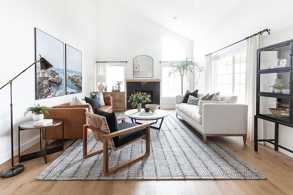
Living Room: Warm neutrals like beige, taupe, or soft greys invite coziness, making everyone feel right at home. Neutral colors can help buyers visualize their own decor in your home, enhancing its appeal. Lighting optimization can further highlight these colors and create a cozy and inviting living room.
Kitchen: Light taupe, soft greens—or even a light mint—bring a clean, fresh feel to the heart of the home. These shades scream cleanliness and charm, helping buyers envision themselves cooking and entertaining in the space.
Bedroom: Here, you want to go for something restful and relaxing. Light grays and soothing blues, or even muted lavender, provide a peaceful retreat. These calming hues can encourage relaxation, making it easy for buyers to imagine unwinding after a long day.
Bathroom: Crisp whites, soft blues, or even pale greens can help you create a spa-like vibe that’ll appeal to buyers looking for a serene, clean space. These colors encourage relaxation and create a sense of cleanliness—just what you want in a bathroom!
By considering the specific function and feel of each room, you can choose colors that not only enhance the space but also help buyers see themselves living there. Keep it simple, fresh, and inviting, and watch how quickly your home becomes the one they can’t wait to move into!
Neutral Paint Colors That Boost Curb Appeal

Darling, when it comes to making that first impression, the exterior of your home is the star player! Think of it as the outfit you’d wear to a big event—it sets the tone for everything that follows. A fresh coat of paint is like giving your home a polished, inviting look that draws people in from the street.
Here are a few ways to use exterior neutrals to enhance your curb appeal:
Timeless White or Soft Greige: A crisp, clean white or a soft greige can work wonders for your home's exterior. These shades reflect light beautifully, making your home appear fresh and bright. White offers a classic, welcoming vibe that can make your house look larger and more inviting, while greige brings a bit of warmth and sophistication, blending effortlessly with any architectural style.
Chic Gray for a Sophisticated Touch: If you’re looking for something a bit more modern, a chic gray is the way to go. Gray adds a calm, sophisticated feel that works well in both contemporary and traditional homes. It’s neutral enough to let your landscaping shine—but still adds depth and character to your home’s exterior.
Warm Beige for a Cozy, Natural Feel: If you want your house to blend in with nature, warm beige tones are a perfect choice. These colors offer a cozy, earthy feel, making your house appear as though it’s part of the landscape. They work beautifully with natural elements like stone and wood, adding a comforting touch that feels both elegant and approachable.
The right color can enhance curb appeal significantly. Don’t forget to reflect your area’s unique charm, like Texas’s warm, inviting Southern vibe. Incorporating local elements into your exterior design can make your home feel rooted in the community. Little touches that celebrate the area can make a big difference in how potential buyers connect with the space.
Of course, the right color is only part of the equation. Add some beautiful landscaping, such as manicured shrubs, colorful flowers, or even a welcoming front porch—and you’ve got a recipe for curb appeal that will be hard to resist.
When buyers see that your home is well-maintained inside and out, they will start imagining themselves living there before they even step inside.
From the curb to the kitchen, our staging services highlight your home’s best features—and make buyers feel right at home. Let’s get started!
How Neutral Paint Can Boost Your Home’s Value
Now baby, let me tell you—paint might seem like a small thing, but honey, it can make a big ol’ difference in your wallet!
Neutral paint isn’t just pretty on the eyes—it’s a smart financial move, too. Fresh, warm-toned neutrals can boost your home’s value by anywhere from 1 to 5%! That’s like finding a little bonus check tucked in the drawer—who wouldn’t want that?
Buyers love that “clean-slate” feeling. A soft beige or warm gray gives them room to dream, to picture their own furniture, their own life, without being distracted by bold colors or loud statements.
And let’s be real:
A freshly painted room says this house is cared for—and that kind of love and attention? Buyers notice it.
Those soft beiges, creamy taupes, and gentle greiges don’t just make your home look stylish—they attract more buyers, lead to better offers, and help your home sell faster. It’s one of the easiest updates you could do for a real return.
So, if you're thinking of selling your home, give the walls a fresh coat of something neutral and welcoming. It’s a small change with a mighty payoff.
Ready to transform your home into a buyer’s dream? Schedule a home staging consultation with Designs by Duchess and let’s get it sold, sugar!
Creating That "Move-In Ready" Atmosphere

Hun, if there’s one thing today’s buyers are hunting for, it’s that move-in ready feeling—the kind that says, "You belong here.” And guess what? Neutral colors are your best friend in making that happen.
Warm whites, creamy beiges, soft grays—these tones open up the space like a sunny Texas morning and make every room feel bigger and brighter, while also letting those gorgeous architectural features shine. It will have buyers walk in and think, “I wouldn’t change a thing.”
And trust me, that’s a recipe for a quick sale!
Keep Neutrals from Falling Flat
While some folks might think a splash of bold color is the way to go, let me share a little insider wisdom that’ll save you from a paint disaster—neutral colors are your best friends when it comes to selling your home fast.
And don’t worry—neutral doesn’t have to mean dull, darlin’. The trick is using these shades with a little intention and a whole lot of heart.
Here’s how to spice up those quiet tones and still keep your home buyer-ready:
Add texture with woven rugs, linen curtains, rattan furniture—these bring warmth and dimension to a space without introducing wild colors.
Mix finishes—think matte walls with glossy ceramic accents or sleek metal fixtures against soft textiles. This contrast gives the eye something to enjoy without overwhelming the room.
Layer with love. Throws, pillows, and soft furnishings in tonal variations keep the palette cohesive but far from boring. It’s like seasoning—just the right sprinkle brings out all the flavor.
With the right touches, a simple neutral room can feel rich, cozy, and oh-so-inviting. It’s all about creating a space that whispers comfort and charm, without raising its voice.
Improve Space Perception
Creating a "move-in ready" atmosphere is all about making your space feel open, inviting, and appealing to potential buyers.
Here’s how to work your magic:
Use light, neutral colors on walls and ceilings; they reflect light beautifully and lift the room's vibe, making it feel spacious.
Strategically place mirrors to double the visual space. Opposite windows? Yes, please! It’s like a light party in your home. Mirrors reflect light and create the illusion of depth, making the rooms feel even larger.
Declutter with purpose! Clean lines and organized nooks create that effortless flow buyers crave. Less stuff, more sparkle.
Want to take things up a notch? Bring in a designer’s touch!
Even simple staging with the right neutral tones can elevate your home’s charm. Buyers love a space that looks curated, cozy, and easy to settle into.
When everything feels fresh, open, and welcoming, your home doesn’t just look ready—it feels ready. And that’s what gets folks lining up at your door.
Want that polished, move-in-ready look buyers can’t resist? Let Designs by Duchess work their magic and bring out your home’s full potential.
Frequently Asked Questions
How do I choose the right neutral for my home’s style?
To choose the right neutrals for your home's style, consider your room's lighting and orientation, and think about the fixed elements, like flooring and cabinets. Warm neutrals pair well with wood tones and improve coziness, while cool tones suit modern designs. Test samples to see how they interact with your space.
Can I mix different neutral shades in one room?
Yes, you can mix different neutral shades in one room. You can blend beiges, grays, and taupes, just keep the undertones consistent and layer in textures for depth. It keeps the room feeling polished and cohesive, not patchy.
What finish should I use for neutral paint?
You should use eggshell or satin finishes for neutral paint. They have that subtle sheen, durability, and are easy to clean—perfect for high-traffic areas. Plus, they create a warm, inviting atmosphere that appeals to potential buyers.
How often should I repaint to maintain a fresh look?
To maintain a fresh look, you should repaint high-traffic areas every 3-5 years, bedrooms and living rooms every 5-7 years, and bathrooms every 3-4 years. Regular touch-ups keep your house inviting and vibrant.
Are there neutral paint colors that work especially well in Texas homes?
Absolutely. Warm tones like creamy taupe, soft beige, and greige reflect all that Texas sunshine and work beautifully with local styles, enhancing your home’s charm while also appealing to potential buyers in your vibrant Texas community.
Your Color-Driven Closing Strategy
Selling your home quickly and for a better price isn’t just about square footage or granite countertops—it’s about how your space makes someone feel the moment they walk in. That is to say, a thoughtfully chosen neutral color does more than brighten walls; it sets the tone for possibility.
So, pick up that paintbrush, unleash your creativity, and make your home unforgettable!
If you're feeling stuck on where to start or which shade suits your space best, let Designs by Duchess step in and guide you. Book a consultation now, and let’s turn your home into the buyer magnet it was meant to be.


Comments